Sports Logo Case Study #4—1978 Vancouver Canucks
The fourth in an ongoing series of entries about vintage sports identities. Sports fans, as I have often said, are the most ardent brand loyalists on the face of the earth. There are stories to be told here at the intersection of art, commerce, history, and fandom.
It's very possible that there has never been a sports identity change quite like the one that the Vancouver Canucks made in 1978.
The tale of this change involves marketing magic, "color psychology," a radical push forward toward with a "pop art" primary logo, and a uniform that was dubbed "the Halloween suit."
First, a few brief words about the identity that was being replaced. The Canucks' identity since their inception in 1970 was both simple and iconic—a hockey stick contained within a rink shape, forming the letter "C." Devoid of embellishment, this clean visual saw the team through the franchise's initial growing pains, a few lean years at the outset which were followed by a brief period of relative success on the ice.

The original logo was designed by Vancouver-based graphic artist Joe Borovich. The unique blue and green color scheme was said to be reflective of the Vancouver area's natural surroundings.
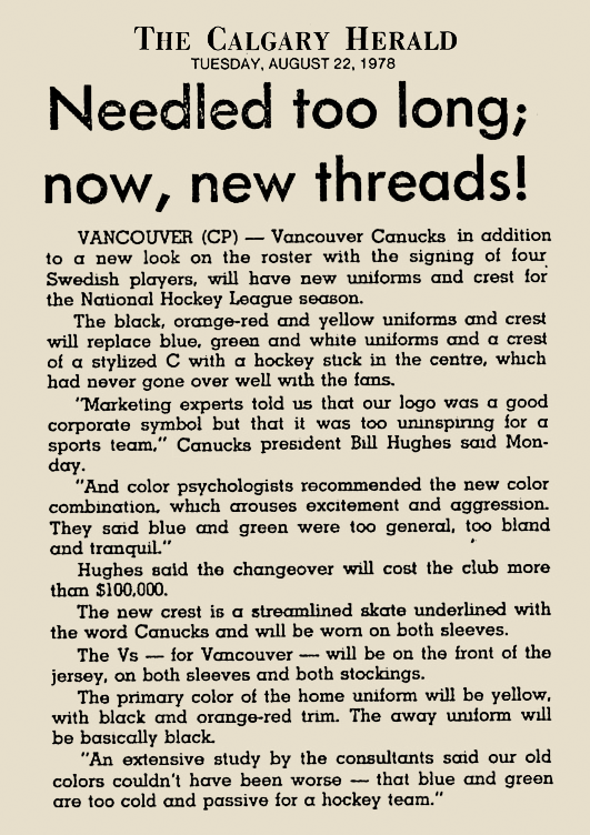
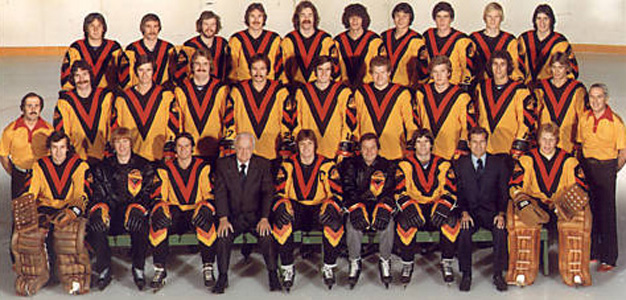
In 1978 the franchise engaged Beyl & Boyd, a San Francisco-based design and marketing firm, to take on the task of creating a fresh, new, modern look for the team. Their efforts (for a reported cost of $100,000) resulted in one of the most memorable sports identities ever created, instantly referred to with derision and ridicule.
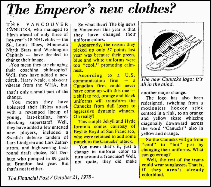
Team President Bill Hughes was quoted as saying that "Marketing experts told us that our logo was a good corporate symbol too uninspiring for a sports team…color psychologists recommended the new color combination which arouses excitement and aggression. They said blue and green were too general, too bland and tranquil…the general public made us decide to change the color and logo. Over the years, we've had more complaints about the crest than anything else. It was too vague. An extensive study by the consultants said our old colors couldn't have been worse-that blue and green are too cold and passive for a hockey team."
Contemporary accounts quoted consultant Bill Boyd as saying:
"White, being a passive color, induces the least response of all. And green—did you know that in ancient times green - not black, but green was the color symbolizing death?"
"White produces no response at all, so we went for yellow—which is warm, pleasant, happy. Upbeat."
"The cool color is passive, the hot one aggressive. Plus the black. It's the contrast of colors that creates emotion."
On the "V" for "Vancouver"—"…it creates the ideal diagonal stripe. All teams have horizontal or vertical stripes. That's static. Diagonal stripes get your attention. They're like the crooked picture on the wall. You have to fix it or it drives you crazy."
Boyd also said that his firm "analyzed the colors and logo of every team in every major-league sport…(and) gave the Canucks 20 different approaches…" These resulted in a primary logo which featured a "pop art" skate speeding over the word "Canucks." It was created by illustrator Mike Bull, and was chosen for its positive attributes of "movement and style."
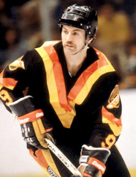
An August 30, 1978 newspaper article penned by columnist Jim Taylor said that "the job is done—a job so radical that the patterns had to be made by a flag-manufacturing company and the actual uniforms will be made by firms new to hockey because the old firms aren't geared to handle them." The article also called the team "No. 15 in the standings and No. 1 on your retinas."
The team experienced one great moment of glory in these uniforms, their first appearance in the Stanley Cup Finals, losing to the New York Islanders 4 games to 0 in 1982. The "V" uniforms were dropped in 1985-86; the flying skate logo made it all the way to 1996-97 before being replaced. And the original "stick-in-rink" logo from 1970 made a comeback (with a bit of updating) in 2003. Finally, a parting shot at the "V" uniforms, from the December 5, 1984 edition of the Montréal Gazette.
